


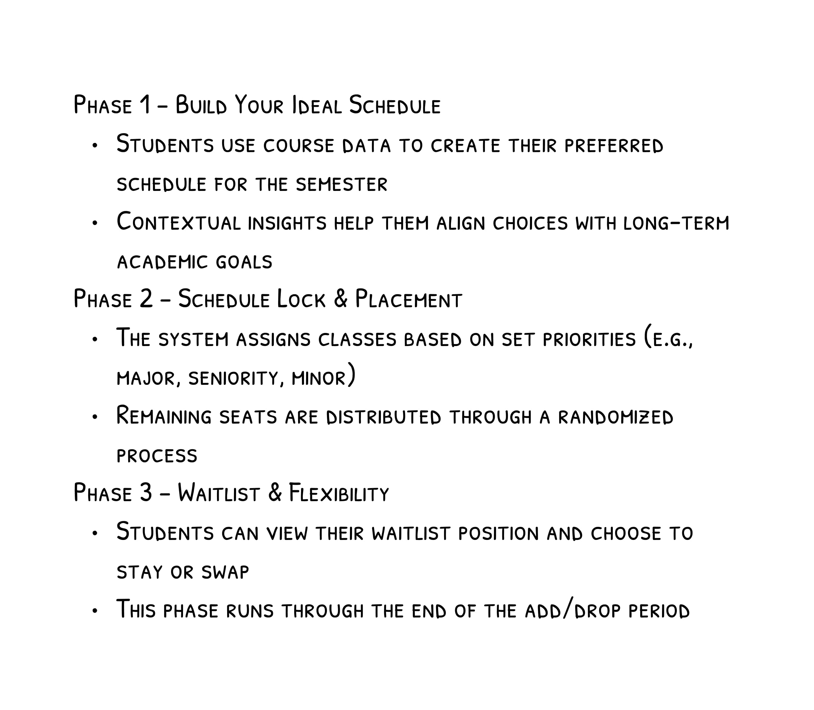
Class registration has always been a high-stress experience for students. As a designer focused on usability and accessibility, I wanted to understand why - beyond just server crashes and slow load times.
Research revealed students were making critical decisions with incomplete information:
This lack of transparency turned a straightforward process into a stressful gamble.
User research revealed more nuanced pain points than expected:

These insights reframed my approach from making registration faster to making it predictable.
I focused on data visualization to surface key information at critical moments:

.jpg)
%20(1).jpg)
Early prototypes included extensive metrics like GPA distributions and pass rates, but user testing revealed students simply wanted to know, "Can I get into this class?" This insight led me to simplify the UI around the most actionable data.
Before Testing

After

Old Version
There weren’t many indicators of system change which caused confusion for some users.

New Version
Inform users of system changes by specifying the scheduled timing and current phase, reinforced by components like this class status visualizer (right).


Old Version
Block-based visualization to help students easily understand their weekly schedule and potential conflicts.
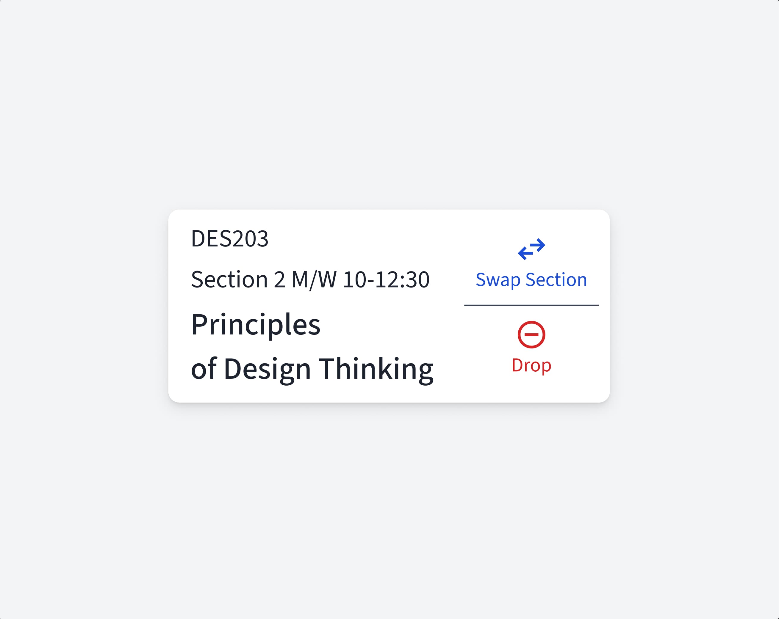
New Version
Usability testing showed participants struggled with identifying scheduling conflicts and swapping waitlisted sections. Clearer conflict indicators and in-line section swaps resolved these issues.

Old Version
Course cards display a percentage to help users gauge their registration chances at a glance.

New Version
Since users found GPA distribution and pass rate data less useful, I focused on registration chance as the key metric and enhanced its visibility with color.


This project reinforced one of my core design beliefs: the best solutions don’t just remove friction—they create clarity. By providing the right information at the right time, I transformed registration from a stressful experience into a predictable, student-centered process.
.png)