


Better School Choice needed a product that would transform a stressful and complex school search into something manageable for parents while creating value for schools seeking their ideal student families. The challenge was clear: simplify complexity without sacrificing quality decision-making.
The existing school selection landscape revealed significant pain points:


These insights emerged from in-depth analysis of interviews with six parents documenting their school search experiences.
A significant gap in the available research was the limited data from lower-income households, highlighting a critical concern: how could I make this experience accessible for people without the time or financial means to conduct thorough research?
This accessibility gap represented my most pressing challenge - reaching precisely those who would benefit most from informed educational choices.
Three key obstacles stood between parents and confident school decisions:

Market research consistently showed competitors clustering at opposite ends of the spectrum - either providing sleek but shallow interfaces or comprehensive but confusing data dumps. The opportunity lay in bridging this divide.
My goal was to engage users in the preliminary stages of their search with the intention of covering the entire research journey in future iterations. I conducted a feature prioritization exercise to determine what my MVP would require.


In defining my MVP, I focused on streamlining the school search experience to make it more accessible for users.
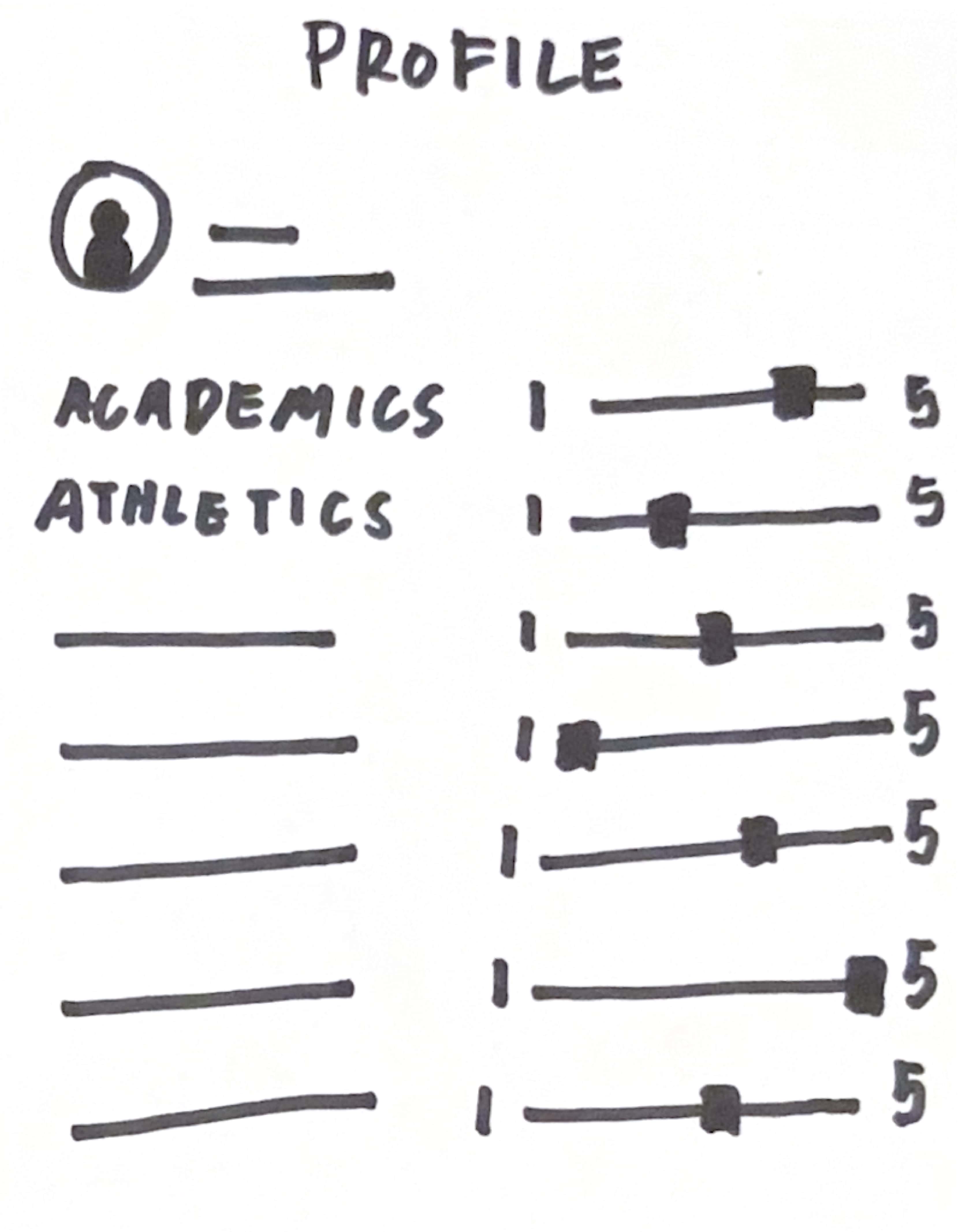
My early iterations were inspired by set and forget search preferences. The onboarding process allowed users to establish search presets, defining the baseline scope for searches each time the user opened the app. Users could customize their search further by selecting additional specifications to focus on.

The onboarding flow included steps for the users to enter basic information and create a profile with their baseline preferences. These search presets included school types (public, private, charter, etc), price, class size, among other filters.

Once the preferences are set, users can access the search page at any point and it would update the results for them automatically depending on which factor they wanted to emphasize.
The usability test supported my hypothesis. While there was more work to be done to optimize the app, it seemed like I was on the right track.

A number of participants requested a feature to let them weigh baseline filters by importance.
I initially thought this feature would be a good way to give users more control over each search and began prototyping ideas for weighing search filters.
.jpg)
.jpg)
.jpg)
But if more complex features were being used to increase the app's usability, then the search process was not being streamlined. I was on the wrong path.
I revisited my research and one quote from a parent stood out to me:
“In the beginning, one school was at the bottom in terms of price and location, because it was the furthest away from us. But the way the meeting went, I was just so amazed and impressed with the way they treated our boys”
I realized that the priorities of users will change over the course of their research journey. Because they weren’t fixed, the set and forget system would not be able to keep up. I had to pivot.
I decided to rework the entire app from the lo-fi wireframes I started with. Throughout this project, I returned to the question: Would this decision simplify the experience?
I streamlined the comparing schools flow by giving the compare feature its own page. The initial flow had too much bloat and moving the profile/accounts page to settings makes the overall app simpler and easier to navigate.


When I streamlined the user flow, I realized that I could apply the same principle with how information was presented. I focused on succinctly synthesizing data while designing the individual and school comparison pages. This would cater primarily to users who are beginning their journey by making information more scannable.


I used the same information chunking concept on the individual school pages to keep the patterns consistent and reduce cognitive load.


I separated filter and search features into two different pages to make it easier to find schools depending on what kind of searching users preferred


I need to conduct two or more rounds of usability testing to get feedback on the new features and make adjustments before handoff.
The concept of negative space is an important consideration when designing visually pleasing layouts as well as conducting research and getting feedback. I found that it is valuable to take a step back from the data, identify what is missing, and why those gaps exist.
.png)