


My role: UX designer on a 2-person team
Timeline: 3 months
Focus: Layout design, visual hierarchy, and user flow optimization
ABS-CBN Foundation International (AFI) faced a common nonprofit problem: their donation system generated one-time contributions during crises but failed to build lasting supporter relationships. The existing system was a basic PayPal checkout where users entered any amount. There was no structure, no incentives to return, and no pathway for deeper engagement.
Key Problems Identified:
Research and Analysis
Working alongside a senior designer, I researched how leading nonprofits structure their giving programs. I analyzed Save the Children and Oxfam's checkout pages, focusing on how they used color coding to help users quickly identify which programs their donations supported. I also studied their use of visual elements during checkout to keep users motivated and connected to the cause.
For the membership tier structure, I examined KQED's layout approach to understand how to present multiple giving levels clearly and accessibly.
Design Solution: Three-Tiered Membership Structure
Pages I Owned:
Membership Landing Page
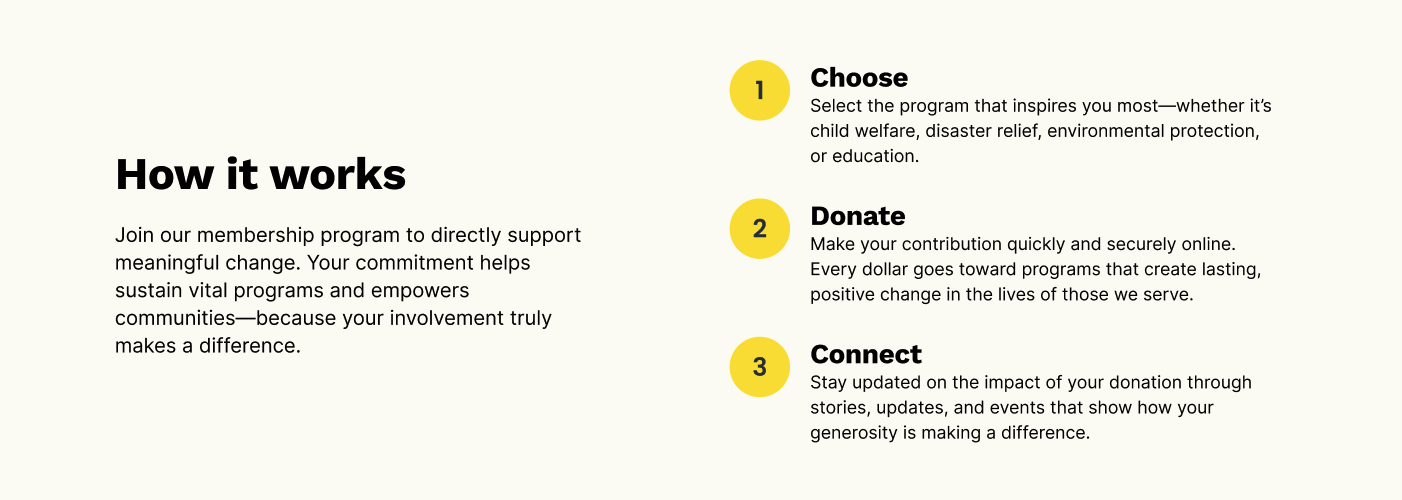
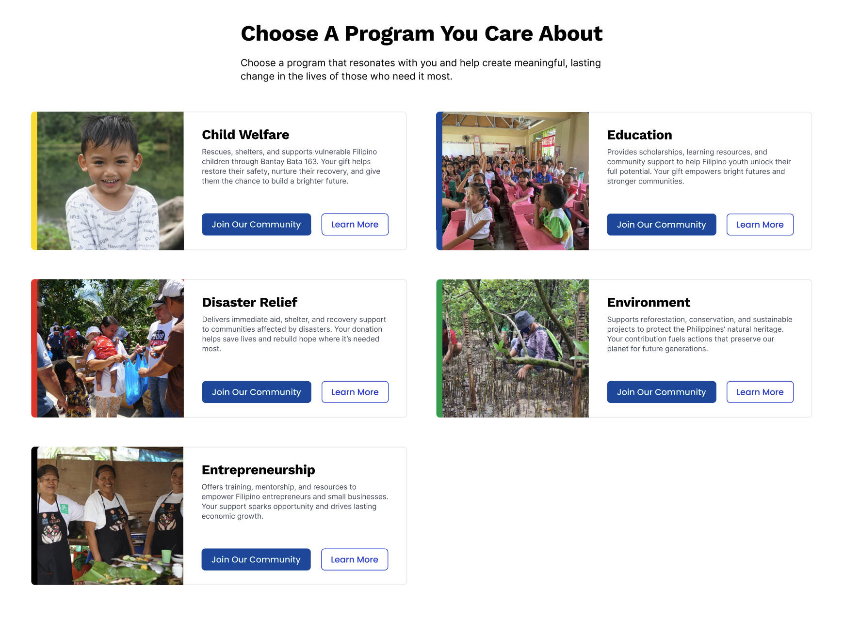
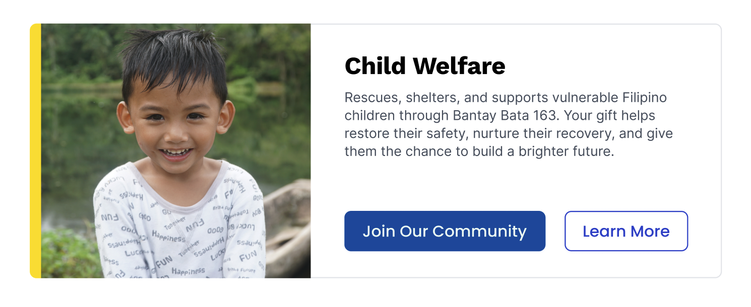
I designed the entry point that reframes donations as membership and belonging. Below the hero section, I created a "How Membership Works" section with three clear steps: choose a program, donate, connect with community. Program cards use the existing site's card pattern create visual consistency through the entire flow.
Membership Tiers Comparison Page
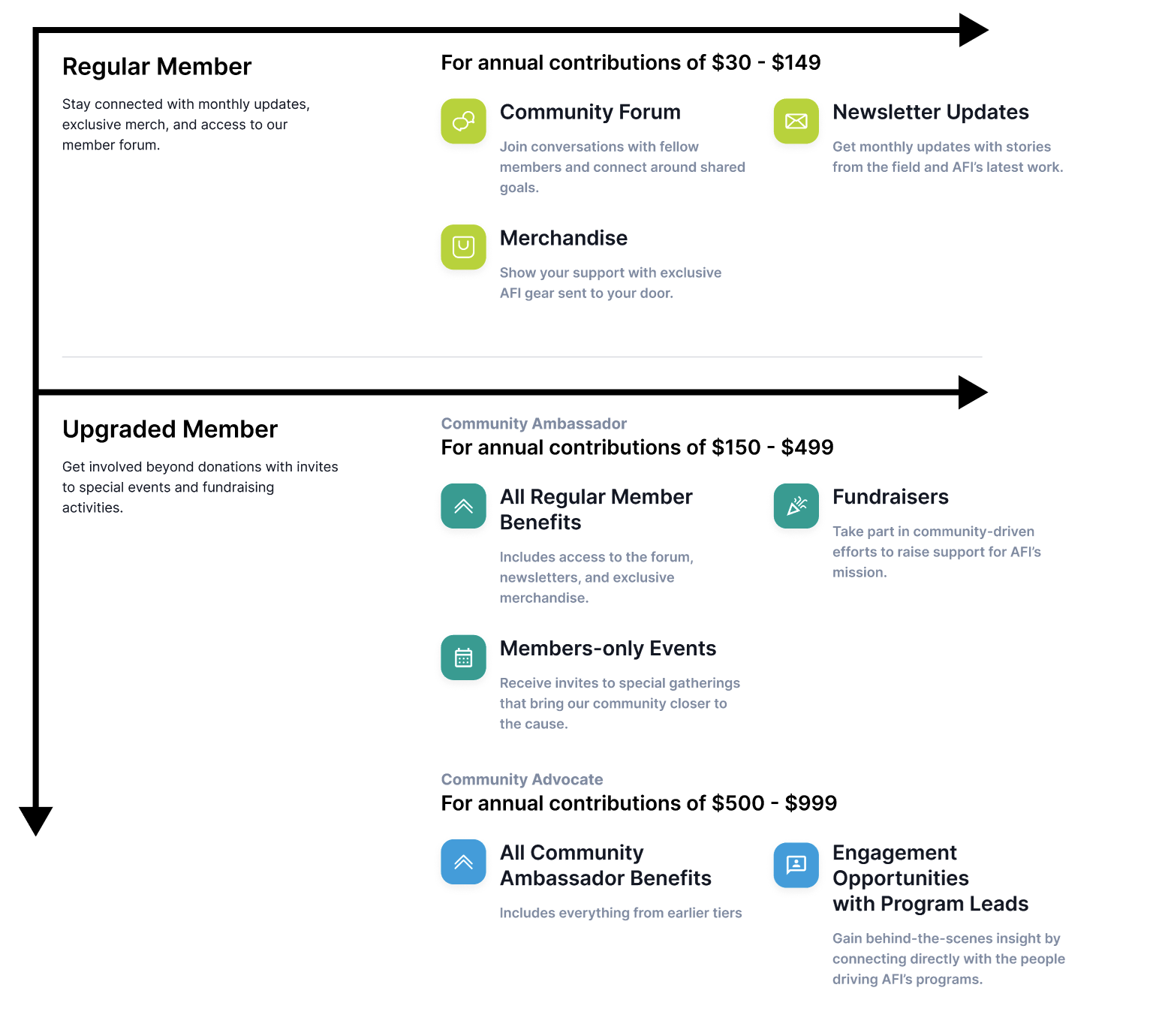
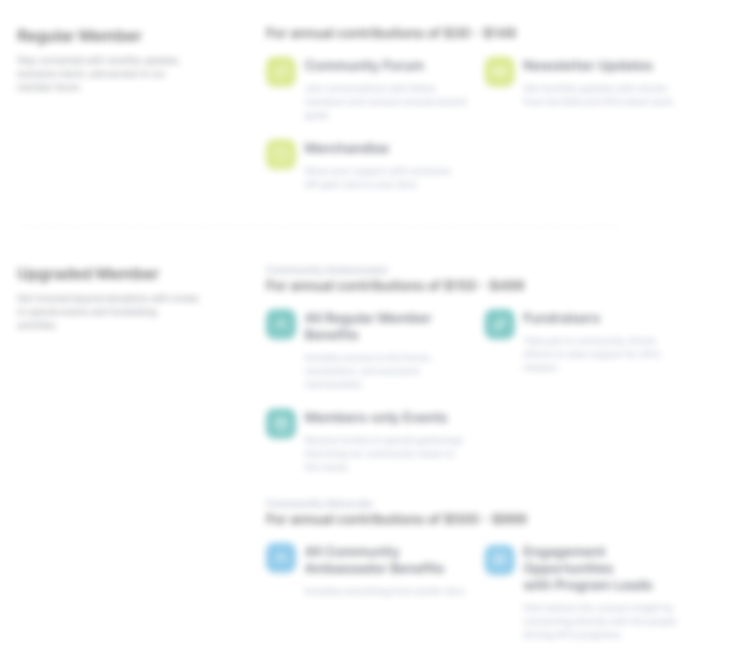
This was the page I'm most proud of. The challenge was presenting complex information—multiple tiers with cascading benefits—without overwhelming users.
My Layout Strategy:
Visual Hierarchy Decisions:
I constantly tested the page by blurring it and looking what caught my attention first, then adjusted typography, spacing, and contrast to ensure the most important information (tier names and key benefits) stood out immediately.
Individual Tier Pages
For users who wanted deeper program information before converting, I designed detailed pages showcasing membership benefits beyond financial contribution, such as exclusive events, community access, and field updates. These pages transform the transaction into a relationship-building opportunity.

Color-Coding System
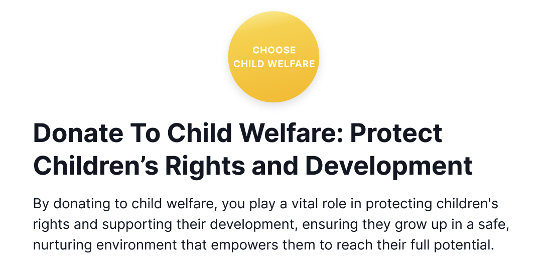
I developed a consistent color system used across program cards and throughout the checkout process. Colors were chosen using color theory principles aligned with program focus areas (green for environment, blue for education) while staying within AFI's brand palette. This created clear visual connections between program selection and donation, reducing confusion about where contributions were directed.
Streamlined Conversion Flow
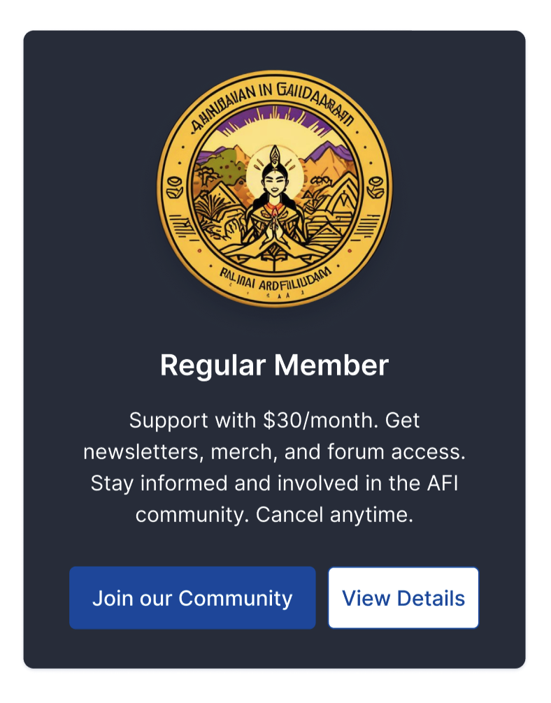
Button Strategy: Each program card includes two paths based on user intent:
This dual-path approach acknowledges that users have different information needs before converting while keeping both options immediately accessible.
Card-Based Layout: Chose cards to amintain consistency with the existing website design language, making the new pages ffeel integrated rather than disconnected.
F-Pattern Layout: Deliberately structured the tier comparison to work with natural reading patterns, placing the most important information (tier names) in high-attention areas.
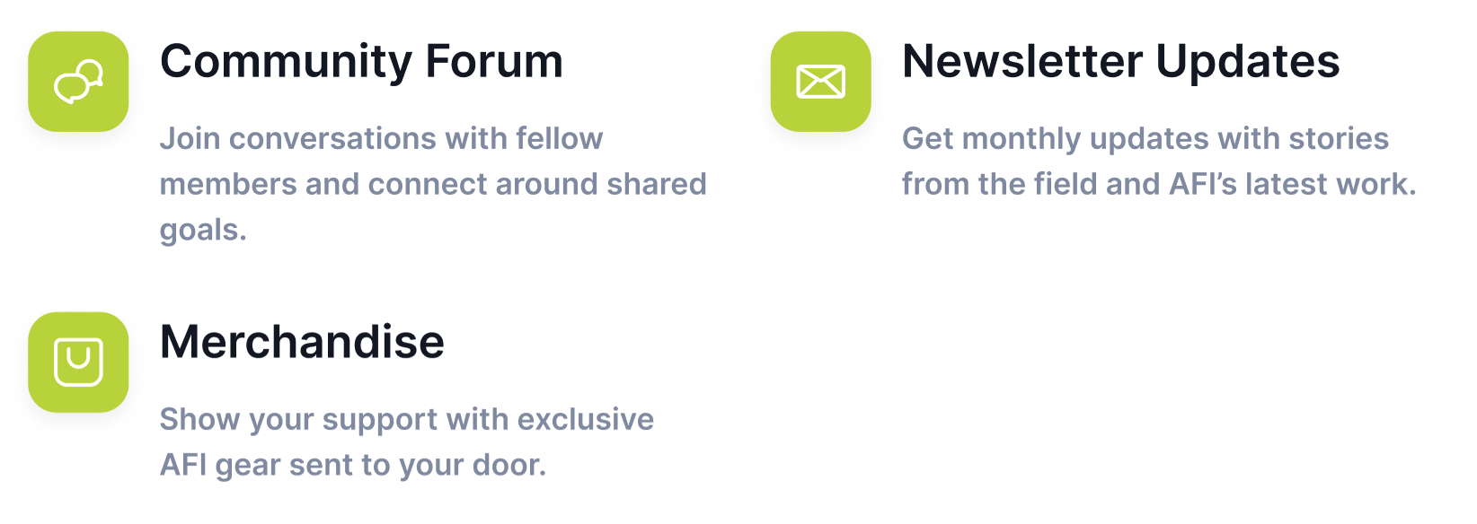
Icon Selection: Prioritized universal recognition over custom design to reduce cognitive load during the scanning process.
Color Psychology: Used strategic color choices to create intuitive connections between program types and visual identifiers, making navigation and selection more intuitive.
Dual Conversion Paths: Recognized that users approach giving decisions differently (some want immediate action, others need more information) and designed to serve both preferences without friction.
Throughout the project, I focused on layout design and visual hierarchy while receiving feedback and strategic direction from the senior designer. Our collaborative research informed my design decisions, but the execution of layouts, visual systems, and user flow optimization was my primary responsibility.
The new membership model creates clear pathways for supporter growth and transforms AFI's approach from reactive crisis fundraising to sustainable, relationship-based giving. The design centers trust, flexibility, and clarity, turning what was once a simple PayPal form into a comprehensive membership experience.
This project reinforced how thoughtful layout and visual hierarchy decisions can transform not just user experience, but the entire relationship between an organization and its supporters. Design became the bridge between one-time transactions and lasting impact.